Completing the Layout
Adding Sample Todos
Let’s add two sample todos within the section that has id="todo-list". Each todo is contained within a div with the class “todo-item”. The todo text is displayed within a div with the class “todo-text”. There is also an input element with the class “hidden todo-edit”, which is hidden at first. We use this input element to edit the todo text. When we double-click on a todo, the text is replaced with this input field.
<div class="p-4 todo-item">
  <div class="todo-text">Buy milk</div>
  <input class="hidden todo-edit" value="Buy milk" />
</div>
<div class="p-4 todo-item">
  <div class="todo-text">Buy bread</div>
  <input class="hidden todo-edit" value="Buy bread" />
</div>
Notice the todo-item, todo-text, and todo-edit are custom classes used to select and style the elements. The hidden and p-4 are Tailwind classes used to hide the input field and add padding to the div elements, respectively.
Adding the Todo Actions Section
Finally, we will add a section for todo actions. This includes a count of the remaining todos, a button to mark all todos as completed, and a button to clear completed todos. Later, we will use JavaScript to hide this section by default and only show it when todos exist.
<section
  id="todo-actions"
  class="flex justify-between p-4 text-sm text-gray-600"
>
  <span id="todo-count">2 items left</span>
  <button id="mark-all-completed" aria-label="Mark all tasks as completed">
    Mark all as complete
  </button>
  <button id="clear-completed" aria-label="Clear completed tasks">
    Clear completed
  </button>
</section>
Here is what the classes on the section element and its child elements do:
flexto set the display property to flex.justify-betweento align the items with space between them along the main axis.p-4to add padding of 4 units.text-smto set the font size to small.text-gray-600to set the text color to gray-600.
Aside-1: The aria-label attribute is used to provide an accessible name for an element when the visible label is not sufficient. In this case, we are using it to provide a label for the buttons that mark all tasks as completed and clear completed tasks. This helps users who rely on screen readers to understand the purpose of the buttons.
Aside-2: The span element is used to group inline elements and apply styles to them. In contrast to div, which is a block-level element, span is an inline element, which means it does not start on a new line. Here, we are using it to display the count of remaining todos. The id="todo-count" attribute is used to uniquely identify this element so that we can easily select it using JavaScript.
Running the App Locally
Run the application and view it in the browser. You should see the following view.
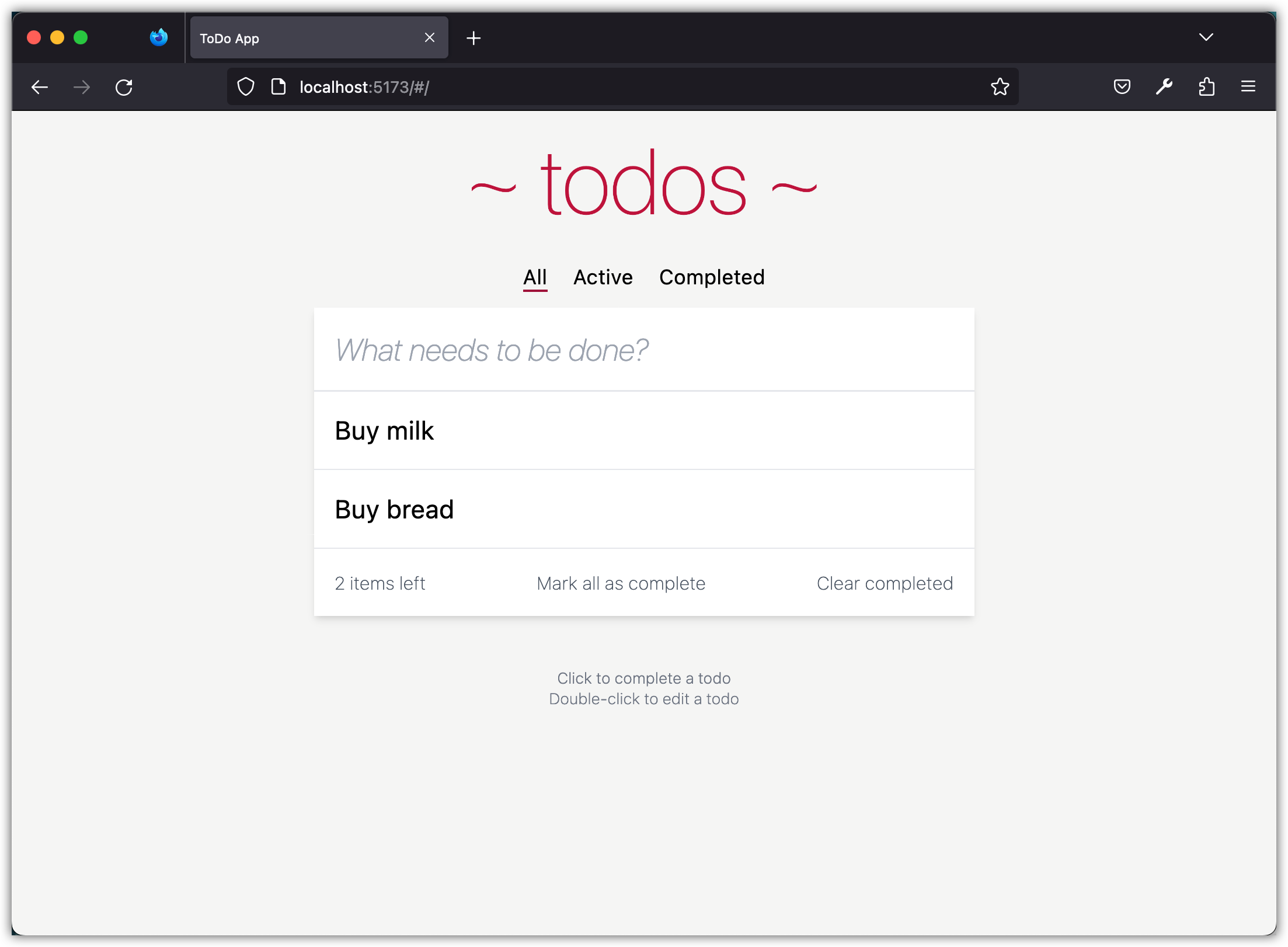
For your reference, this is the complete HTML file:
<!doctype html>
<html lang="en">
  <head>
    <meta charset="UTF-8" />
    <link rel="icon" type="image/png" href="/favicon.png" />
    <meta name="viewport" content="width=device-width, initial-scale=1.0" />
    <title>ToDo App</title>
  </head>
  <body class="bg-stone-100">
    <!-- Header here ↓ -->
    <header class="max-w-lg py-4 mx-auto mt-5 font-thin text-center">
      <h1 class="font-sans text-7xl text-rose-700">~ todos ~</h1>
    </header>

    <!-- This nav should be hidden by default and shown when there are todos ↓ -->
    <nav
      id="todo-nav"
      class="flex items-center justify-center gap-3 py-2 filters"
      role="navigation"
    >
      <!-- This nav item is selected by default ↓ -->
      <a
        href="#/"
        class="p-1 underline underline-offset-4 decoration-rose-800 decoration-2"
        role="button"
        >All</a
      >
      <a href="#/active" class="p-1" role="button">Active</a>
      <a href="#/completed" class="p-1" role="button">Completed</a>
    </nav>

    <main class="max-w-lg mx-auto font-thin bg-white shadow-md">
      <!-- This input should always be shown ↓ -->
      <input
        id="new-todo"
        placeholder="What needs to be done?"
        autofocus
        class="w-full p-4 text-2xl italic outline-0 focus:outline-1 focus:outline-offset-0 focus:outline-rose-700"
      />

      <!-- This section should be hidden by default and shown when there are todos ↓ -->
      <section
        id="todo-list"
        class="flex flex-col w-full text-xl font-normal divide-y"
      >
        <div class="p-4 todo-item">
          <div class="todo-text">Buy milk</div>
          <input class="hidden todo-edit" value="Buy milk" />
        </div>
        <div class="p-4 todo-item">
          <div class="todo-text">Buy bread</div>
          <input class="hidden todo-edit" value="Buy bread" />
        </div>
      </section>

      <!-- This section should be hidden by default and shown when there are todos ↓ -->
      <section
        id="todo-actions"
        class="flex justify-between p-4 text-sm text-gray-600"
      >
        <!-- This should be `0 items left` by default -->
        <span id="todo-count">2 items left</span>
        <!-- Hidden if no active items are left ↓ -->
        <button
          id="mark-all-completed"
          aria-label="Mark all tasks as completed"
        >
          Mark all as complete
        </button>
        <!-- Hidden if no completed items are left ↓ -->
        <button id="clear-completed" aria-label="Clear completed tasks">
          Clear completed
        </button>
      </section>
    </main>

    <!-- This footer shows minimal instructions on how to use the app ↓ -->
    <footer
      class="flex flex-col items-center justify-center max-w-lg mx-auto mt-10 text-xs text-gray-500 font-extralight"
    >
      <div>Click to complete a todo</div>
      <div>Double-click to edit a todo</div>
    </footer>

    <!-- Scripts here. Don't remove ↓ -->
    <script type="module" src="/src/main.js"></script>
  </body>
</html>
Aside: A common complaint about Tailwind CSS is that all those classes make the HTML cluttered. That is a fair complaint. The long class lists do make the HTML harder to read and maintain. On the other hand, the utility classes let us build and change styles quickly. It is a trade-off, and which side you land on depends on the project and on your own preference.
Checkpoint: Commit your progress.
git add .
git commit -m "todos-06: Set up the layout and styling"
git push