Designing the User Interface
In this section we design the user interface of the “Rock, Paper, Scissors” game. We add the game buttons, put them in a Bootstrap container, and lay them out with a responsive grid.
Adding Game Buttons
We use Bootstrap for two things:
- Over twenty built-in components that websites commonly need, such as navbars and menus.
- A layout system (container, grid, and so on) that arranges those components in a responsive way.
Here, “responsive” means the layout and the styling adjust to the screen, so the page renders well on any device or screen size.
We will use both of them in our application. To start, let’s add three buttons to the page (within the body tag):
<body>
  <button>Rock</button>
  <button>Paper</button>
  <button>Scissors</button>
  <!-- Not shown: Bootstrap JavaScript bundle -->
</body>
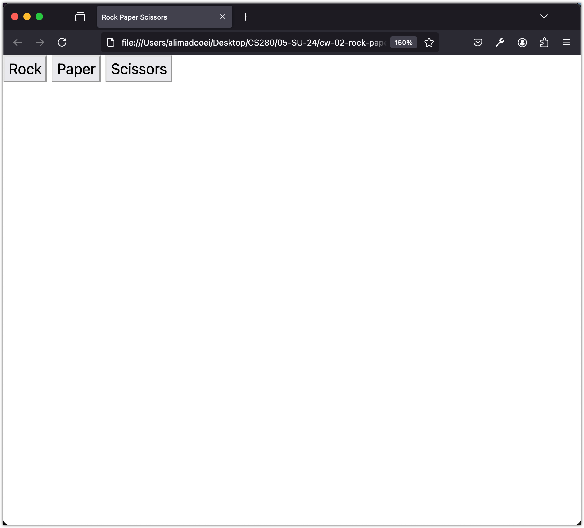
After saving the file, open it in the browser. Notice that the buttons are too close to the edge of the page.
Using Bootstrap Containers
Start by wrapping the buttons in a Bootstrap container:
 <body>
+  <div class="container">
     <button>Rock</button>
     <button>Paper</button>
     <button>Scissors</button>
+  </div>
 </body>
After saving the page, view it in the browser.
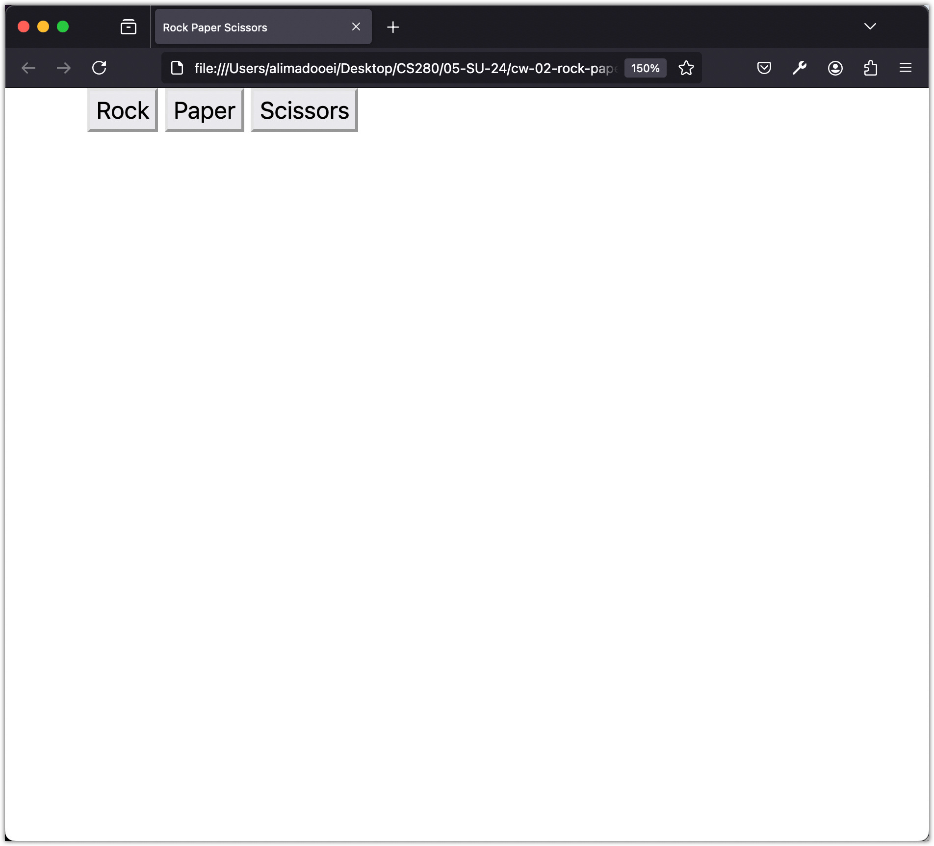
You might notice that the buttons are too close to the top of the page. We can fix that with Bootstrap shorthand for margin:
 <body>
-  <div class="container">
+  <div class="container my-5">
     <button>Rock</button>
     <button>Paper</button>
     <button>Scissors</button>
   </div>
 </body>
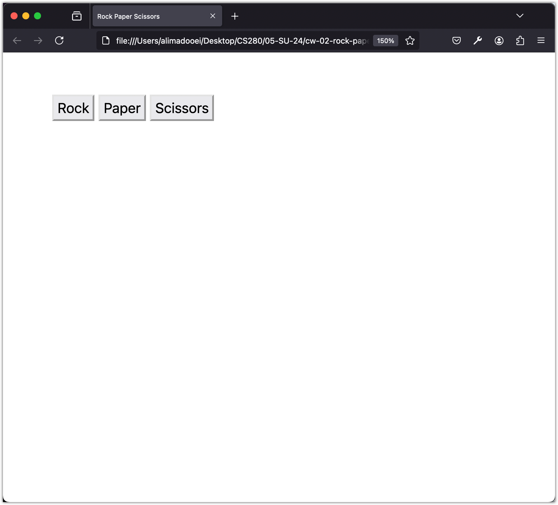
The my-5 class adds a margin to the top and the bottom of its HTML element. Bootstrap has many shorthand classes like this for margin and padding. You can read more about them here.
Then save the page and view it in the browser again.
Laying Out the Buttons with the Grid
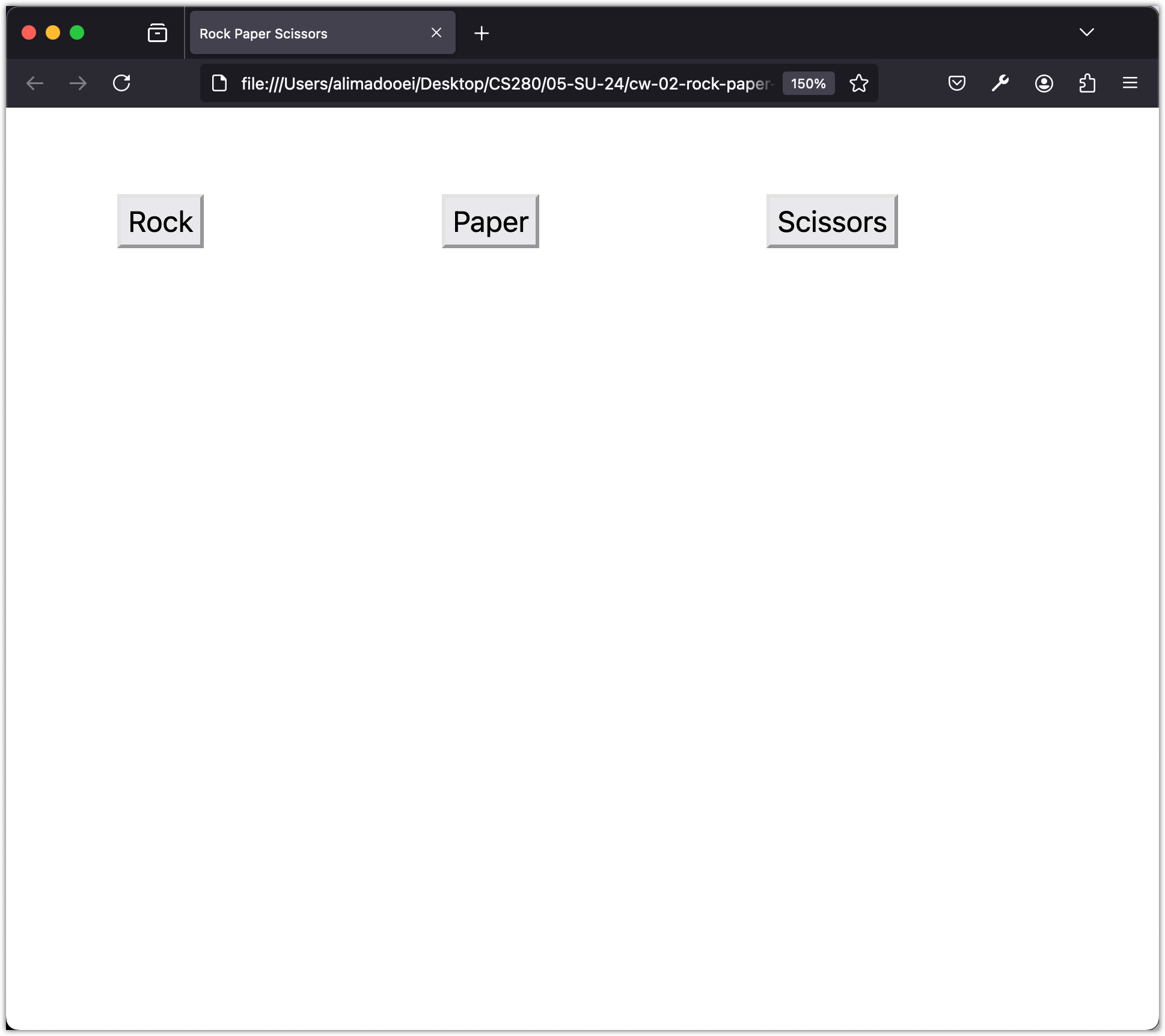
We will use Bootstrap’s grid system to space the buttons evenly:
 <body>
  <div class="container my-5">
+   <div class="row">
+     <div class="col">
        <button>Rock</button>
+     </div>
+     <div class="col">
        <button>Paper</button>
+     </div>
+     <div class="col">
        <button>Scissors</button>
+     </div>
+   </div>
  </div>
 </body>
Bootstrap’s grid system uses containers, rows, and columns to lay out and align content. It is built with flexbox and it is fully responsive. A row is divided into 12 columns, so you can build different layouts for different screen sizes.
To build a basic grid, add a container class to an element. That centers the element and gives it a max width. Inside the container, use a row class to make a new row. Inside the row, add col classes to make columns.
The grid also has offset and ordering classes if you need more control over the layout.
Save the page and view it in the browser.
Checkpoint: Commit your progress.
git add .
git commit -m "rps-02: Add game buttons with grid layout"
git push