Polishing the App
Our app has all its features working, but it looks rough. In the section on CSS fundamentals, we learned selectors, properties, and how to link a stylesheet. Now we will apply polished, professional styles.
The CSS we are about to use includes techniques like flexbox layouts and gradients. We have not covered these yet, but you will run into them as you keep learning web development. For now, we will apply the styles and briefly explain what they do.
The Complete CSS
Replace the entire contents of index.css with the following:
html {
  box-sizing: border-box;
  font-size: 16px;
  height: 100%;
  font-family: "Poppins", sans-serif;
  background-color: #282828;
  color: #e5e5e5;
}

*,
*:before,
*:after {
  box-sizing: inherit;
}

body,
h1,
h2,
h3,
h4,
h5,
h6,
p,
ol,
ul {
  margin: 0;
  padding: 0;
  font-weight: normal;
}

ol,
ul {
  list-style: none;
}

img {
  max-width: 80%;
  height: auto;
  transform: rotate(-25deg);
}

button {
  margin: auto;
  border: none;
  outline: none;
  border-radius: 0.5rem;
  background: #996fe5;
  color: #e5e5e5;
  font-size: larger;
}

button:hover {
  opacity: 90%;
}

button:active {
  transform: scale(0.98);
}

#app {
  display: flex;
  flex-direction: column;
  justify-content: space-between;
  align-items: center;
  text-align: center;
  gap: 2rem;
  max-width: 412px;
  margin: 0 auto;
  min-height: 100vh;
  background: linear-gradient(#8462bd, #4c0db8);
  background-repeat: no-repeat;
  font-size: large;
}

#prompt-section {
  display: flex;
  flex-direction: column;
  gap: 2rem;
  padding: 2rem;
}

#result-section {
  display: flex;
  flex-direction: column;
  gap: 2rem;
  padding: 2rem;
}

.button-group {
  display: flex;
  justify-content: space-between;
  flex-wrap: wrap;
}

#calc-btn {
  padding: 0.5rem 2rem 0.5rem 2rem;
}

#refresh-btn {
  padding: 0.5rem 2rem 0.5rem 2rem;
}

#return-btn {
  padding: 0.5rem;
}

#img-container {
  display: flex;
  justify-content: flex-start;
  align-items: flex-end;
  overflow: hidden;
}

#wakeup-hours-div {
  display: flex;
  flex-direction: column;
  gap: 0.5rem;
}

.cycle {
  background-color: #e5e5e5;
  color: #282828;
  padding: 0.5rem;
  border-radius: 0.5rem;
  font-size: larger;
}

#cycle-1 {
  background: #ffb9af;
}
#cycle-2 {
  background: #ffdaa3;
}
#cycle-3 {
  background: #e5e5e5;
}
#cycle-4 {
  background: #b5ffff;
}
#cycle-5 {
  background: #87fda1;
}
#cycle-6 {
  background: #b1ff8c;
}

.hidden {
  display: none !important;
}
What Is Happening in the CSS
Here is a brief overview of the key techniques used:
-
CSS Reset: The rules for
*,body, headings, etc. remove default browser styling so we start from a consistent baseline. -
Flexbox layout (
display: flex): A CSS layout system that makes it easy to arrange elements in rows or columns, center content, and distribute space. Theflex-direction,align-items,justify-content, andgapproperties control how children are arranged. -
Moon positioning: The
#appusesjustify-content: space-between, which pushes the image container to the bottom. The#img-containeruses flexbox to position the moon at the bottom-left corner. -
Gradient background (
linear-gradient): Creates a smooth color transition from purple to darker purple. -
Viewport units (
100vh): Thevhunit means “viewport height.” Settingmin-height: 100vhensures the app fills at least the full viewport height. -
Transform effects (
rotate,scale): CSS can rotate, scale, and move elements. We rotate the moon image and shrink buttons slightly when clicked. -
Color-coded cycles: Each wake-up time has a unique ID (
cycle-1throughcycle-6), so we can give each one a different background color. Warmer colors (red, orange) mean less sleep. Cooler colors (blue, green) mean more sleep.
A Note on !important
Notice that the .hidden class uses !important:
.hidden {
  display: none !important;
}
When two CSS rules conflict, the more specific one wins. ID selectors (#result-section) are more specific than class selectors (.hidden). So if #result-section has display: flex, it would normally override display: none from .hidden, and the hidden class would not work.
The !important flag overrides normal specificity rules. Use it sparingly. It can make CSS harder to maintain if overused. But for utility classes like .hidden that must always work, it is the right choice.
You will learn these techniques properly as you continue with CSS. For now, the important thing is that you can read the CSS and get a general sense of what each section does.
Updating the JavaScript
We want the moon image to disappear when showing the results, and reappear when going back. Add a reference to the image container at the top of index.js:
const imageContainer = document.getElementById("img-container");
Update calcWakeUpTimes to also hide the image container:
promptSection.classList.add("hidden");
imageContainer.classList.add("hidden");
resultSection.classList.remove("hidden");
And update goBack to show it again:
function goBack() {
  promptSection.classList.remove("hidden");
  imageContainer.classList.remove("hidden");
  resultSection.classList.add("hidden");
}
Testing the Complete App
Refresh and test the full flow:
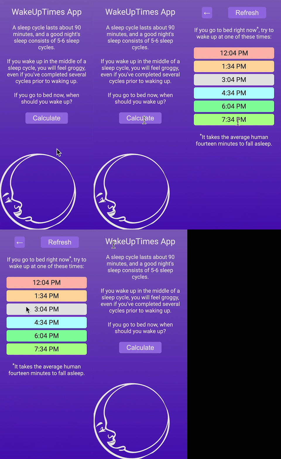
- Click Calculate. The prompt and moon disappear, and you see 6 color-coded wake-up times.
- Click Refresh. The times should recalculate.
- Click ←. You should return to the initial screen with the moon.
- Click Calculate again. You should be back at the results.
Your app should look and behave like this:
Checkpoint: Commit your progress.
git add .
git commit -m "wakeup-06: Polish the app with final styles"
git push