Create layout and style
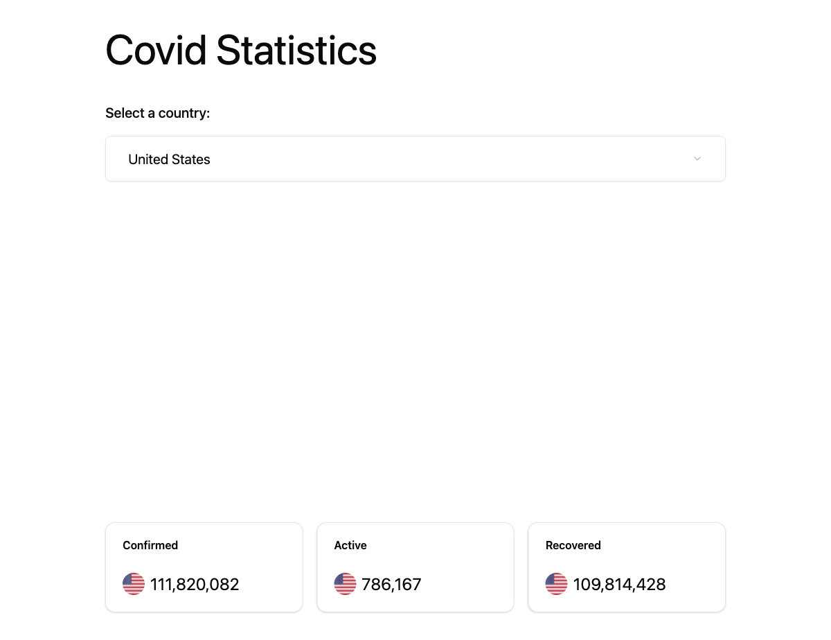
Now that we have our API functions ready, let’s build the UI. We will create two components: a country selector dropdown and a statistics display. For now, we will use hardcoded data to get the layout right. We will wire up state and real API calls in the following sections.
The SelectCountry component
Create a new file src/components/select-country.tsx:
import {
  Select,
  SelectContent,
  SelectItem,
  SelectTrigger,
  SelectValue,
} from "@/components/ui/select";
import { Label } from "@/components/ui/label";

const SelectCountry = () => {
  return (
    <div className="w-full space-y-12">
      <h1 className="text-6xl">Covid Statistics</h1>
      <div className="flex flex-col gap-5 justify-start w-full">
        <Label className="text-xl">Select a country:</Label>
        <Select value="us">
          <SelectTrigger className="w-full text-xl p-8 bg-white">
            <SelectValue placeholder="Country..." />
          </SelectTrigger>
          <SelectContent>
            <SelectItem value="us">United States</SelectItem>
            <SelectItem value="ca">Canada</SelectItem>
          </SelectContent>
        </Select>
      </div>
    </div>
  );
};

export default SelectCountry;
The DisplayStatistics component
Create a new file src/components/display-statistics.tsx:
import { Card, CardContent, CardHeader, CardTitle } from "@/components/ui/card";
import { Avatar, AvatarFallback, AvatarImage } from "@/components/ui/avatar";

const DisplayStatistics = () => {
  return (
    <div className="flex w-full justify-between flex-col sm:flex-row gap-5">
      <Card className="w-full">
        <CardHeader>
          <CardTitle>Confirmed</CardTitle>
        </CardHeader>
        <CardContent className="flex justify-end items-center gap-2">
          <Avatar>
            <AvatarImage src="https://disease.sh/assets/img/flags/us.png" />
            <AvatarFallback>US</AvatarFallback>
          </Avatar>
          <div className="text-2xl">{(111820082).toLocaleString()}</div>
        </CardContent>
      </Card>
      <Card className="w-full">
        <CardHeader>
          <CardTitle>Active</CardTitle>
        </CardHeader>
        <CardContent className="flex justify-end items-center gap-2">
          <Avatar>
            <AvatarImage src="https://disease.sh/assets/img/flags/us.png" />
            <AvatarFallback>US</AvatarFallback>
          </Avatar>
          <div className="text-2xl">{(786167).toLocaleString()}</div>
        </CardContent>
      </Card>
      <Card className="w-full">
        <CardHeader>
          <CardTitle>Recovered</CardTitle>
        </CardHeader>
        <CardContent className="flex justify-end items-center gap-2">
          <Avatar>
            <AvatarImage src="https://disease.sh/assets/img/flags/us.png" />
            <AvatarFallback>US</AvatarFallback>
          </Avatar>
          <div className="text-2xl">{(109814428).toLocaleString()}</div>
        </CardContent>
      </Card>
    </div>
  );
};

export default DisplayStatistics;
Update App.tsx
Now update src/App.tsx to use the new components:
import SelectCountry from "@/components/select-country";  // 👀
import DisplayStatistics from "@/components/display-statistics";  // 👀

function App() {
  return (
    <div className="flex flex-col justify-between items-center min-h-screen max-w-4xl m-auto py-10">
      <SelectCountry />
      <DisplayStatistics />
    </div>
  );
}

export default App;
Notice how we have broken the UI into two smaller components. This is the same pattern you have been using since the Counter and Dice Roller apps. SelectCountry handles the dropdown, DisplayStatistics handles the cards. Each one is a self-contained piece of the UI with its own markup and logic, and App puts the two of them together.
Run the app to see the layout:
Checkpoint: Commit your progress.
git add .
git commit -m "dashboard-04: Create layout and style for the Covid Dashboard App"
git push