Install and configure shadcn/ui
Building a dashboard means lots of UI elements — cards, dropdowns, avatars, and more. We could style everything from scratch, but that is a lot of work. Instead, let’s use shadcn/ui, a popular component library built on top of Radix UI primitives and styled with Tailwind CSS. The components come already built and accessible, so we do not have to write them ourselves.
The starter code includes a React project scaffolded with Vite, along with Prettier and Tailwind CSS. Install dependencies and start the dev server:
pnpm install
pnpm dev
When you open the dev server in your browser, you should see a page with the “Covid Dashboard” title centered on the screen.
Set up path aliases
shadcn/ui expects a @/* path alias pointing to your src directory. This lets you write short imports like @/components/ui/button instead of long relative paths. Vite does not set this up by default, so we need to configure it manually in several places.
First, update tsconfig.app.json to add the path mapping:
{
  "compilerOptions": {
    /* Other compiler options... */
    "paths": {
      "@/*": ["./src/*"]
    }
  }
}
Next, update tsconfig.json to include the same path mapping:
{
  /* Other options... */
  "compilerOptions": {
    "paths": {
      "@/*": ["./src/*"]
    }
  }
}
Next, install the Node types package (if not already installed) and update vite.config.ts to resolve the alias:
pnpm install --save-dev @types/node
import path from "path";  // 👀 Add this import
import { defineConfig } from "vite";
import react from "@vitejs/plugin-react";
import tailwindcss from "@tailwindcss/vite";

// https://vite.dev/config/
export default defineConfig({
  plugins: [react(), tailwindcss()],
  /* 👀 Add this resolve section */
  resolve: {
    alias: {
      "@": path.resolve(__dirname, "./src"),
    },
  },
});
Initialize shadcn/ui
Run the shadcn init command:
pnpm dlx shadcn@latest init
You will be prompted to select a component library and a preset. For the component library, choose “Radix”. For the preset, choose “Nova - Lucide / Geist”.
This makes several changes to your project:
- Adds
components.json— the central configuration file that tells the CLI where to place components and which styling approach to use. - Adds
src/lib/utils.ts— acnutility function for conditionally combining Tailwind class names. - Updates
src/index.cssto include shadcn/ui base styles and design tokens. - Updates
package.jsonwith dependencies like@radix-ui/react-*andlucide-react. - Adds
src/components/ui/button.tsx— a sample button component.
Now let’s add the components we will need for the dashboard:
pnpm dlx shadcn@latest add label select card avatar
This creates component files under src/components/ui/.
Test the setup
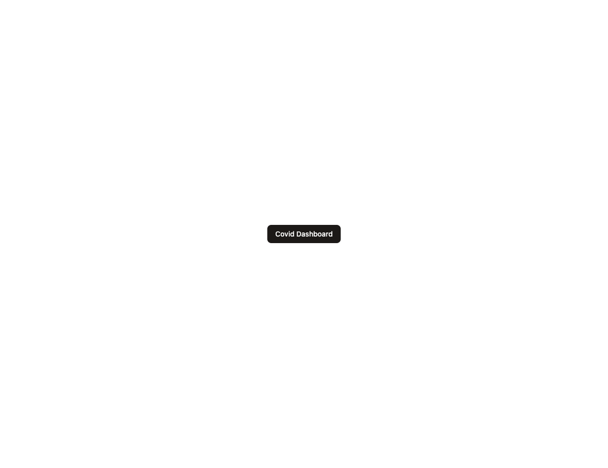
Update App.tsx to render a shadcn button:
import { Button } from "@/components/ui/button";

function App() {
  return (
    <div className="flex min-h-screen items-center justify-center">
      <Button>Click me</Button>
    </div>
  );
}

export default App;
Run the app and confirm the styled button appears.
Checkpoint: Commit your progress.
git add .
git commit -m "dashboard-01: Install and configure shadcn/ui"
git push