Enhancing Interface Responsiveness and Visual Appeal
In this task we will make the “Rock, Paper, Scissors” interface look better and work at different screen sizes. We will style the game buttons with Bootstrap, test responsiveness with the developer tools, use breakpoints to adjust the layout, and add a jumbotron.
Styling Buttons with Bootstrap
Let’s style the buttons using Bootstrap’s Button component:
 <body>
   <div class="container my-5">
     <div class="row">
       <div class="col">
-        <button>Rock</button>
+        <button class="btn btn-primary btn-lg w-100">Rock</button>
       </div>
       <div class="col">
-        <button>Paper</button>
+        <button class="btn btn-primary btn-lg w-100">Paper</button>
       </div>
       <div class="col">
-        <button>Scissors</button>
+        <button class="btn btn-primary btn-lg w-100">Scissors</button>
       </div>
     </div>
   </div>
 </body>
Here is what each class does:
btn: This is the base class for all button types in Bootstrap. It makes the element a button.btn-primary: This adds the primary color (usually blue) to the button.btn-lg: This class makes the button size large.w-100: This class sets the width of the button to 100%, making it span the full width of its parent container.
After saving the page, view it in your browser.
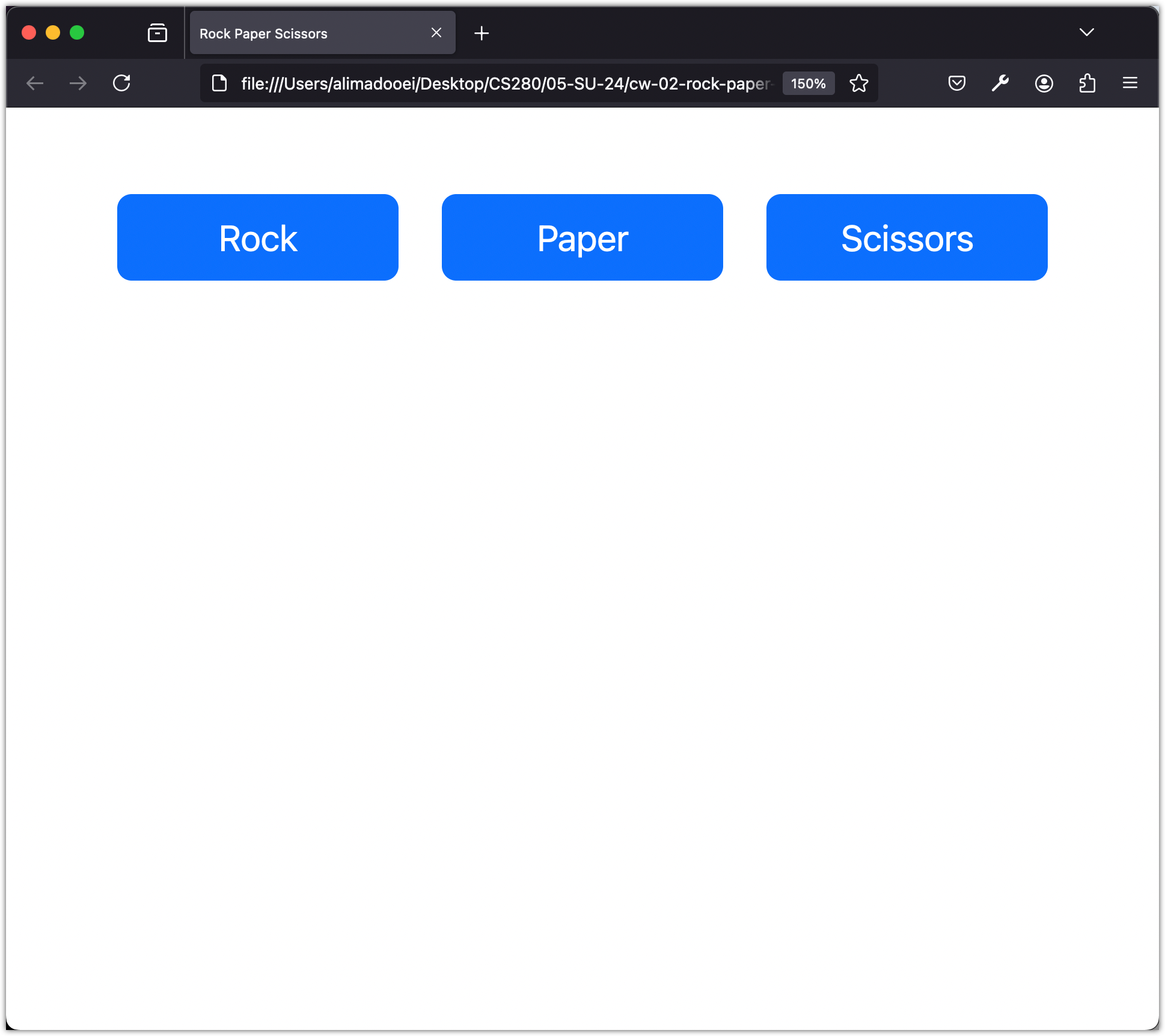
Testing Responsiveness with Developer Tools
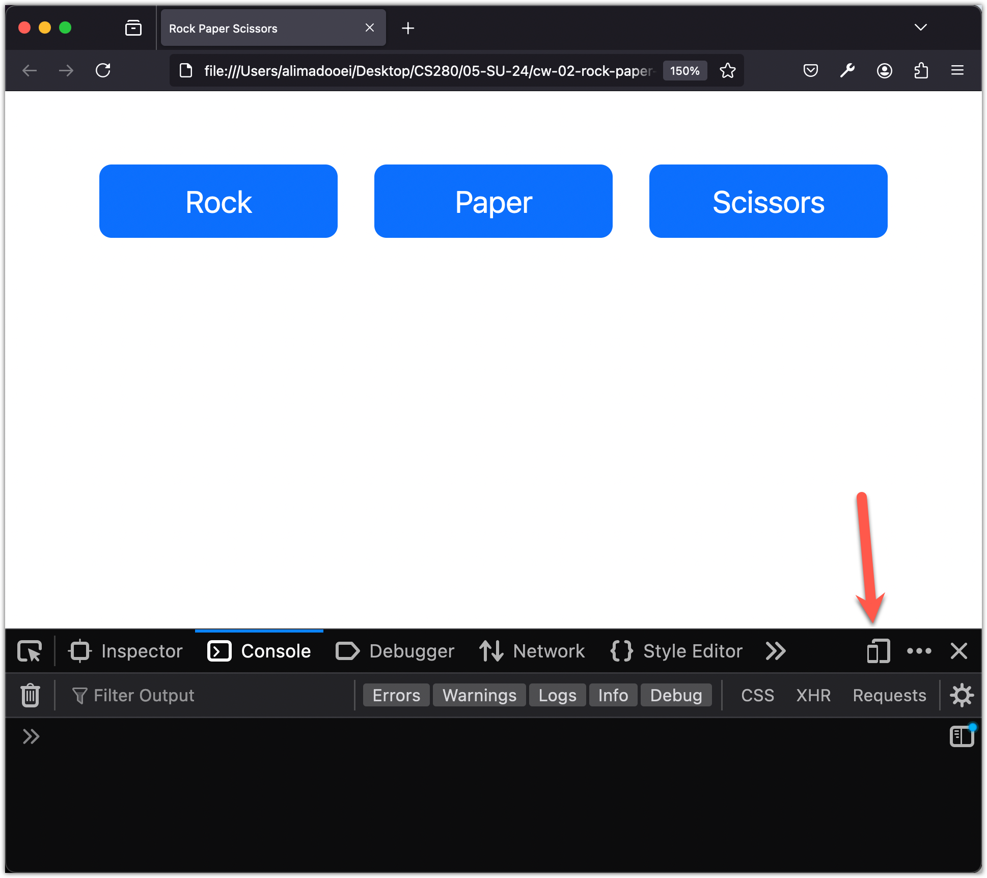
Let’s look at how Bootstrap handles responsiveness. Start by opening the developer tools, then click the “Responsive Design Mode” in the top right corner of the Developer Tools window.
Next, adjust the screen size. As the screen size changes, you will see the page margins, the button sizes, and the spaces between the buttons change with it. When the screen width drops below a certain width, the columns stack vertically instead of getting narrower and narrower, so the buttons stay readable.
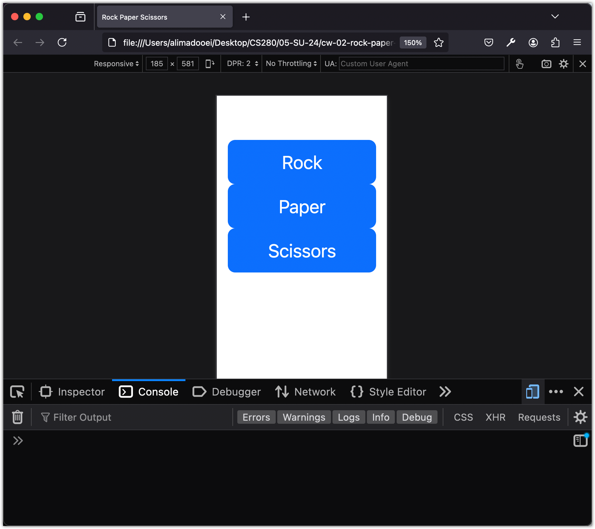
That width is called a breakpoint. Bootstrap breakpoints are the widths at which the layout changes, and you can customize them.
Managing Breakpoints for Layout Adjustments
Bootstrap defines these breakpoints as follows:
| Screen Size | Breakpoint | Class modifier |
|---|---|---|
| Extra small | 576px | none |
| Small | 576px | -sm |
| Medium | 768px | -md |
| Large | 992px | -lg |
| Extra large | 1200px | -xl |
| Extra extra large | 1400px | -xxl |
We can use these class modifiers to change our layout at different breakpoints.
For example, as the screen gets narrower, there is a width where the 3-column layout stacks. Before that width, though, there is a stage where the last column stacks under the first two.
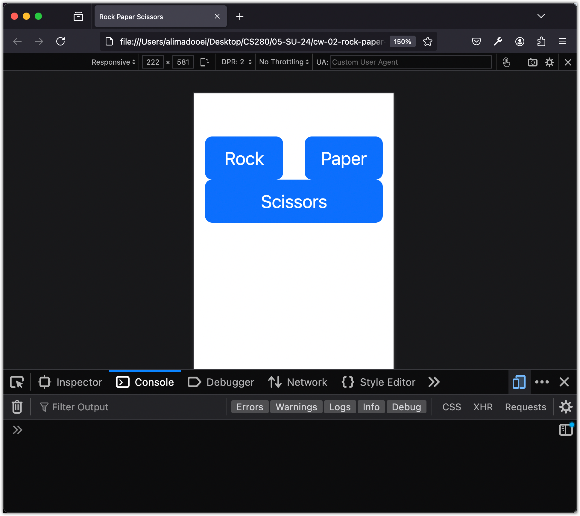
We do not want that intermediate step. We want the layout to go straight from 3 columns to 3 stacked rows. A breakpoint class modifier lets us do that, so the first two columns stack at the same time as the last one:
 <body>
  <div class="container my-5">
    <div class="row">
-     <div class="col">
+     <div class="col-sm">
        <button class="btn btn-primary btn-lg w-100">Rock</button>
      </div>
-     <div class="col">
+     <div class="col-sm">
        <button class="btn btn-primary btn-lg w-100">Paper</button>
      </div>
-     <div class="col">
+     <div class="col-sm">
        <button class="btn btn-primary btn-lg w-100">Scissors</button>
      </div>
    </div>
  </div>
 </body>
Adding -sm ensures that when we reach the 575px breakpoint, all three columns expand fully.
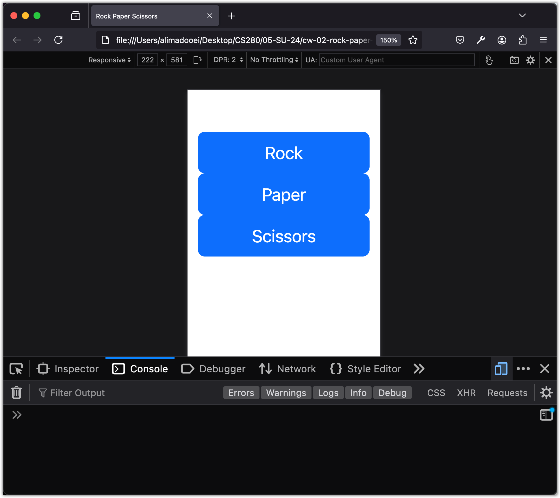
Finally, let’s adjust the gap between the columns so they look better when stacked.
 <body>
  <div class="container my-5">
-   <div class="row">
+   <div class="row gap-2">
      <div class="col-sm">
        <button class="btn btn-primary btn-lg btn-block">Rock</button>
      </div>
      <div class="col-sm">
        <button class="btn btn-primary btn-lg btn-block">Paper</button>
      </div>
      <div class="col-sm">
        <button class="btn btn-primary btn-lg btn-block">Scissors</button>
      </div>
    </div>
  </div>
 </body>
The gap-2 class in Bootstrap adds space between columns in a row, or between rows in a container. The number 2 sets the size of the gap. You can change the gap size by changing this number.
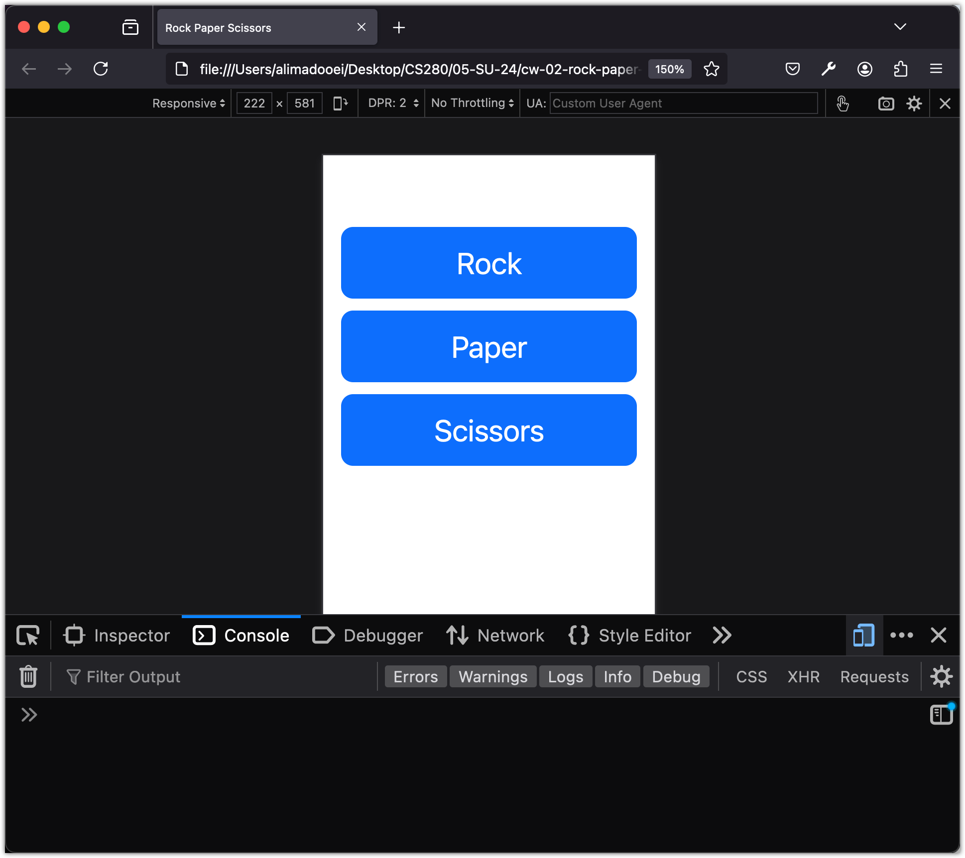
Bootstrap’s grid system includes many other layout options.
Adding a Jumbotron for Emphasis
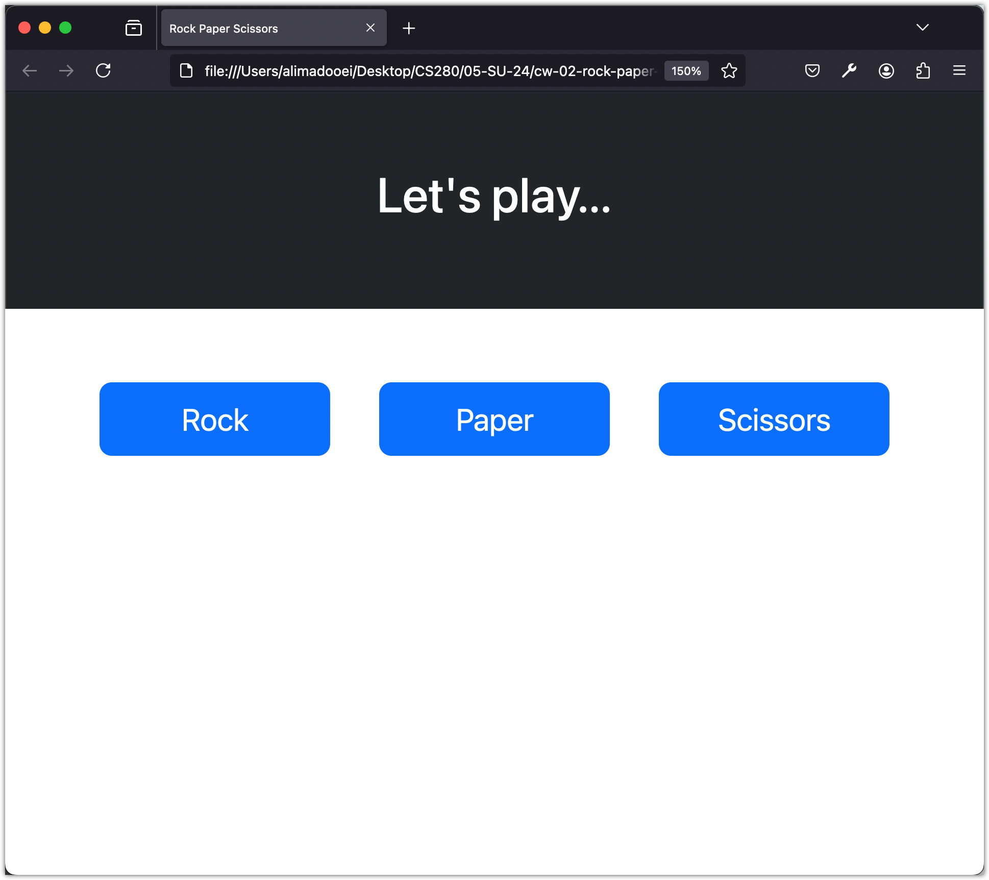
Next, let’s add a jumbotron (pronounced jum-bo-tron) component to our app.
Insert the following code snippet at the beginning of the body element, just beneath the <body> tag:
<div class="container-fluid p-5 bg-dark text-white text-center">
  <h1>Let's play...</h1>
</div>
Here is the result:
Checkpoint: Commit your progress.
git add .
git commit -m "rps-03: Style buttons and add jumbotron"
git push